The CEO Index: how we combined art & science
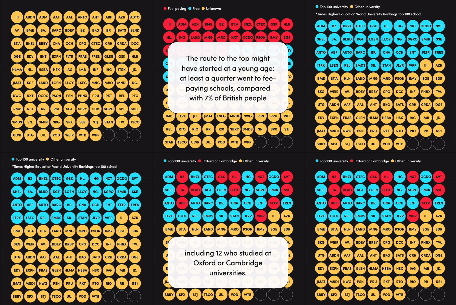
Raconteur has just released a new edition of the CEO Index – an annual project, launched in 2023, which provides an overview of the people running the biggest listed companies in the UK.
The 2024 edition has already produced some great results in terms of reader engagement. But it also gives me an opportunity to highlight another important topic that we’ve written about recently: the art and science of content creation.
When we create content, whether it’s our editorial, our marketing initiatives or content we produce for our commercial partners, we’re always trying to find the best possible way to reach the target audience and bring our (or our clients’) value proposition to life.

First and foremost, having an original and interesting idea is key. But how we present those ideas, how we facilitate the absorption of information, makes a huge difference to how well we can serve our readers and drive engagement. We’re always asking: Does this piece of content capture attention? Is it useful? Is it memorable? Is it shareable? Etc.
When we talk about art we’re talking about how we can, in a literal sense, present content in a way that delights the reader. For us, that often means thinking about what our design team can do that’s unique and interesting.
With science, we’re talking about data. What data can we find? Can we match it up with our audience data? What kind of reader data can we capture that will improve engagement in the future? And, how do we use that to improve?
So it’s about matching data with visual representation, all underpinned by a creative idea. It’s the combination of these that really brings content to life. We can put a lot of data in front of people, but without engaging presentation, you’re asking a lot of readers to be able to absorb it effectively.

The CEO Index illustrates this approach very well. It started, like all of these things do, with a great idea and this one came from one of our data journalists. We decided we wanted to shine a spotlight on the lack of diversity at the top levels of British business.
This obviously isn’t a new issue, of course, but that doesn’t mean we should shy away from covering what is a very real problem. When it comes to how we do this though, while there are senior leaders at UK businesses who want to talk about this topic, let’s be honest, they’ve probably been asked to comment on it quite a lot and they may be facing some fatigue. This is why it’s so important to use art to create something that people will actually want to engage with. Otherwise, it’s just more of the same.
One of the key features of the CEO Index is the calculator, which enables readers to create their own stories in a sense. Readers can compare themselves to FTSE 100 CEOs across a range of data points, including gender, ethnicity, disability status and education, among others. It’s a really powerful way to get readers thinking about this data and, by adding that personal element, the point hits home in a way that it wouldn’t by merely looking at the figures.
So we have all this data on FTSE 100 CEOs, but how do we present it in a way that readers can absorb it and understand it? It takes art and science – different teams working together, from data and editorial to design and social media. Something that otherwise would be ‘just another feature article on diversity’ instead becomes something memorable; something that sticks because it’s presented in an engaging way.
We can see the benefits of this approach in the numbers attached to this project. It’s getting great levels of interaction on our website, on social media and on LinkedIn; it’s driven a lot of registrations and has already produced a lot of great data for us, which helps us to understand our audience better.
And, crucially, it’s shareable. People want to share their results: how similar are you to the average FTSE 100 CEO? People don’t share content that is just ‘kind of interesting’. They share stuff they connect with and want their friends and colleagues to connect with too. It elicits a range of emotions and it’s exactly the kind of engagement we’re hoping for with an art and science approach.
You can read more about the art and science of content creation here and read all of our great content on FTSE 100 CEOs, including the calculator, here.
